
Books You Should Judge By Their Covers
by Adrian Mendoza ‘25
When it comes to choosing your next read, the old phrase “don’t judge a book by its cover” might come to mind. You might say, “Some of the best books may not have great covers!” or alternatively, “Some of my least favorite books have amazing covers.” You would be correct in each of these statements, but that doesn’t mean you can’t use covers as one way to determine if it will be your next read.
The publishing industry puts careful consideration into the types of covers that go with each book. The cover they use may indicate the genre or tone of the book, incorporate key aspects of the narrative through illustration, or simply reflect the latest trend in the industry. All of these can be used to learn about the book you’re considering reading. To illustrate this point, here are some of the best book covers that not only reflect how good the book is, but indicate what you’re getting into when you read it.
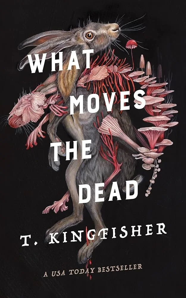
What Moves the Dead by T. Kingfisher (2022)
Cover art by Christina Mrozik; Cover design by Peter Lutjen
What Moves the Dead lives up to its cover as an enticing and eerie retelling of The Fall of the House of Usher by Edgar Allen Poe. It takes the established characters of the story and makes them new and thoroughly fleshed out. It also follows an original protagonist, Alex Easton, as they uncover the unexplained details of the original text. Whether you’re a fan of Edgar Allen Poe or you’re just now hearing about this story, this book is a great read.
This is easily my favorite cover of any book I’ve read. It has a seamless mix of beauty and creepiness. It’s both pleasing to the eye and unnerving to the mind. This is fitting for this horror book and incorporates many elements directly related to the story. The color scheme makes the cover for me, though. The soft pinks contrasted with the black background makes the image pop while offering a subtle sense of gore.

Aristotle and Dante Discover the Secrets of the Universe by Benjamin Alire Saenz (2012)
Cover art by Sarah J. Coleman; Cover design by Chloë Foglia
The text of this book feels like long childhood summers. Ari meets Dante as he’s struggling to swim at the public pool, and it sets off a perfect coming of age story. Immediately, the two’s differences are evident as Ari is reserved and cynical while Dante is outgoing and unceasingly optimistic. Still, the two become best friends despite all their differences and individual struggles. Together they grapple with their identities in various ways and help shape how they grow into adulthood.
The detail of this cover might be easy to dismiss at first glance, but the tone and feeling that it evokes is instant. With its soft gradient and cool color scheme, it perfectly illustrates an early morning just before sunrise. Beyond the landscape, however, are little details that pertain to the book. The truck is an obvious reference to the main character’s own truck that proves important to the narrative, while other elements are more hidden in the patterns around the top edges. While I don’t know the intention behind the patterns, you can see the influence of Mexican design, each of the main characters’ initials, and symbols like books that reflect each character’s interests.
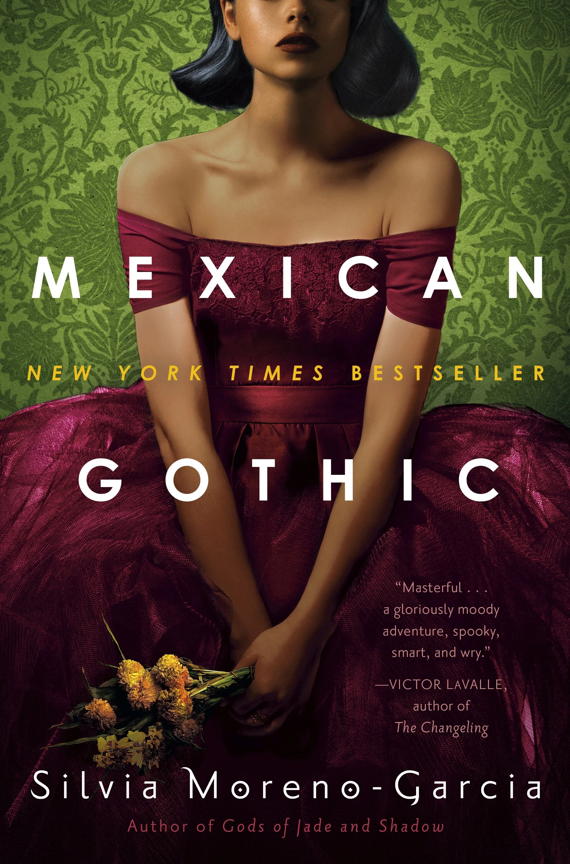
Mexican Gothic by Silvia Moreno-Garcia (2020)
This novel is a gothic horror story about Noemi, a girl from Mexico City who travels to a small, rural town to check in on her cousin after receiving a concerning letter. This is out of Noemi’s character, but she decides to go as a way to please her father. My biggest criticism of this book is that it draws on European standards of the gothic novel rather than reimagining the genre to be new and entirely Mexican. Nonetheless, it features a charming protagonist and a compelling storyline that is well illustrated by its cover.
The cover of Mexican Gothic gracefully captures the eeriness of the book with a simple and eye-catching art style. The cover features the novel’s main character, Noemi Taboada, in her typically fancy dress. Her face is cut off in a way that I interpret as a form of silencing and loss of agency. She also appears stoic, as though enduring something unpleasant impassively.
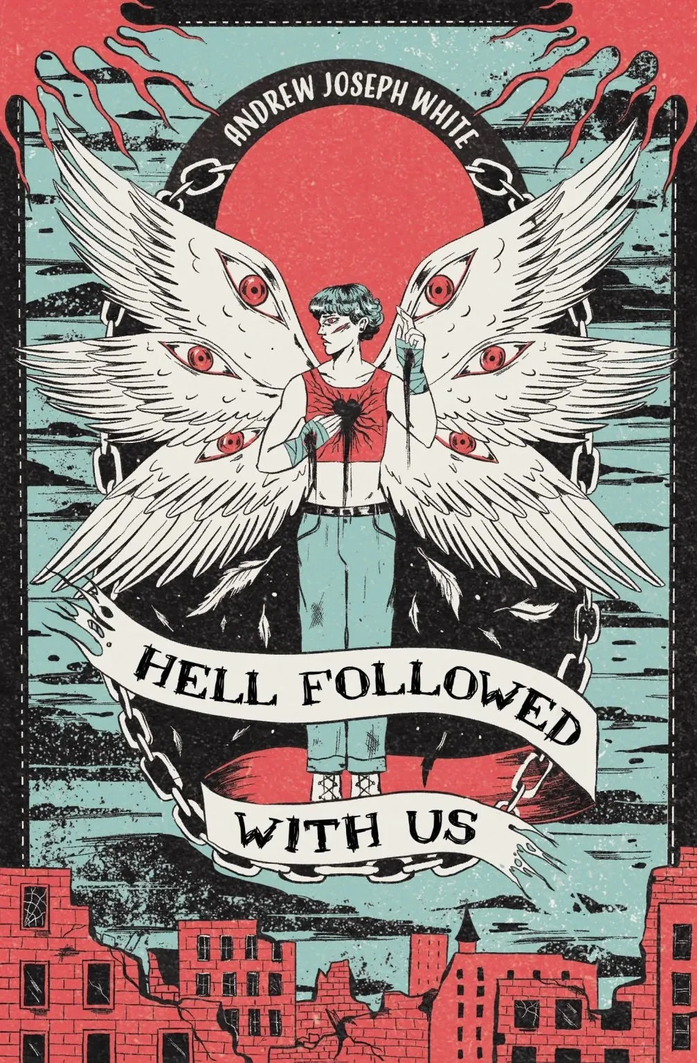
Hell Followed With Us by Andrew Joseph White (2022)
Cover art by Evangeline Gallagher
The boy shown on this cover is the main character of the book, Benji. He is a trans boy who has just narrowly escaped the cult he was raised in. This cult also happens to have caused the apocalypse and experimented on Benji, turning him into a monster meant to lead them in the eradication of all “non-believers.” Slowly transforming, Benji finds safe haven with a group of LGBTQ+ teens and young adults trying to survive in a world out to get them. This is a story that pulls no punches and is willing to grant beaten down kids with a chance at revenge.
There is a lot going on in this cover, but most prominently featured is an illustration of a trans boy with an infected heart sprouting angel wings. He is then surrounded by images of apocalyptic ruins. This is an art style I’ve seldom seen on book covers, and it’s also unique in its depiction of a transmasc person wearing a binder. This is amazing to see on a cover, but notably, the character portrayed on the cover does not wear a binder in the book itself, so it is a bit out of place. My favorite element of this cover, however, is the subtle color palette of the trans pride flag!
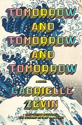
Tomorrow and Tomorrow and Tomorrow by Gabrielle Zevin (2022)
Cover design by John Gall
While I normally don’t gravitate to covers that are text heavy, this colorful cover is my exception. In the background, you can see a portion of Japanese painting ‘The Great Wave off Kanagawa’ overlaid in bold rainbow print that displays the book’s long title, Tomorrow and Tomorrow and Tomorrow, and the author’s name. This painting is relevant to the book as the characters take inspiration from it when creating their hit video game. Aside from this, however, the cover does little to indicate the plot or tone of the book in favor of being eye catching.
Tomorrow and Tomorrow and Tomorrow is, on the surface, a story about a couple of college students making it big in the video game design industry, but on a deeper level, it is a book that’s about friendship, trauma, and the corrosive force of corporate desire. It not only follows those college students through their process of building a video game company but also shows the early formation of their friendship as young kids with time to kill in a hospital, through all the relationships they build in their adult lives.

The Vanishing Half by Brit Bennett (2020)
This book hase many overlapping narratives but executes it in a very readable way. The chronology and transitions of the novel are clean and easy to follow. It seamlessly shifts from one generation to the next while maintaining a consistent connection to a central theme. The story begins with two twin sisters, both Black and both white-passing, in a town consumed by its colorism. When one, determined to make her own way, decides to use her privilege of passing, the sisters are then separated, but their paths remain intertwined.
I opted to feature the UK version of this cover because of the sleekness of its design. While the American version is eye-catching, this one more clearly illustrates the silhouettes and captures a key component of the story by showing one figure as lighter and one as darker. I also enjoy the overlapping lines that feel as though they are flowing across the cover.

Before the Coffee Gets Cold by Toshikazu Kawaguchi (2015)
In this story, customers of a small cafe in Tokyo are given the opportunity to travel into the past of the cafe to meet former visitors dead or alive. Despite this fantastical component, the structure of this story is very simple, just like the cover, and is broken up in the form of interconnected short stories. With each story, your understanding of how the cafe works builds and you become familiar with regular customers. The short stories have a consistent voice and style that focuses on the mundane within the magic throughout the story.
This simple yet effective cover shows the key component of this book’s narrative: the act of sitting down and sharing a cup of coffee with someone. It makes use of empty floor space with an off-center title with deliberately lowercase letters, softening the overall appearance. It uses perspective in the most minimal way possible, indicating the shift from the floor to the wall not only with the addition of wallpaper and chairs placed just barely on the white of the floor.

Yellowface by R.F. Kong (2023)
This story is told from the perspective of a white author with a burning jealousy toward an Asian author who she superficially calls her friend. When this friend dies suddenly, the protagonist takes the opportunity to steal her work-in-progress manuscript. The protagonist passes this work off as her own, creating a deep spiral through the lens of an unreliable narrator. You continue to follow her as she lies and misleads in order to succeed in the publishing industry, ultimately falling back on her white-privilege to hold onto what she has deceptively created for herself.
The cover speaks for itself when paired with the title. Without the inclusion of each feature of the face, the eyes in the middle of an all yellow cover captures the sharp satirical element of the text in a simple and clever way. The eyes don’t literally belong to the main character, but it is the implied persona that the character immorally takes on as an author.

Open Water by Caleb Azumah Nelson (2021)
Open Water is written in 2nd person where “you” are an unnamed protagonist who meets an unnamed woman through a mutual friend. This protagonist learns that she is a dancer, and she loves books and music and art the way that he does. They make instant friends but achingly slow lovers. All the while, they grapple with the racism and targeted police brutality in London where they live during the times that they are together. Normally I am a big fan of short books, but I did not want this one to end so soon. That said, it is perfectly paced and its brevity is likely for the best.
This cover is the one and only exception to my firm stance that real people should not be on book covers. Open Water is simply different. This cover is simple and emotional. The faces shown reflect the struggle of the main characters The plain background and simple font makes the cover uncluttered and impactful. It also doesn’t hurt that this is truly one of the best books that I have ever read.
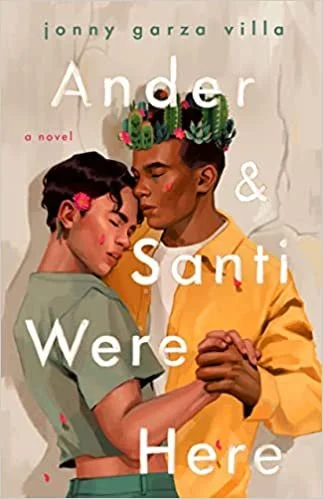
Ander & Santi Were Here by Jonny Garza Villa (2023)
Ander & Santi Were Here is a love story – a romantic, platonic, and familial love story. It follows Ander, a young muralist just out of high school and still trying to figure out what’s the best path for their future. But when a new hire at their family’s taqueria, Santi, shows up, their future starts to look a lot like theis cute new boy. Santi, however, has his own struggles that makes him resistant to pursue the painter that he’s so clearly attracted to.
This cover is said within the book itself to be inspired by the photograph ‘two men dancing’ by Robert Mapplethorpe. In the original photo, two white men are shown dancing closely with crowns on their heads and the entire image is in greyscale. There is a clear difference between the inspiration photograph and the vibrant result that instead depicts the two main characters in full color and a crown of cacti on Santi’s head.
Want more from Trojans 360?
Visit Trojans 360 on Facebook & Twitter to stay up to date with more student content! You can also Ask A Trojan an anonymous question, and we’ll try to answer it in a future post. And don’t forget to follow us on Instagram!
Trojans 360 is USC’s official student-run blog. Content created by students, for students.